MY CHOICE: Freyja Wrigglesworth / September 2022

September 2022: Freyja Wrigglesworth
Each month a member of our community is invited to browse our online collection and select six of their favourite artworks. Each My Choice selection, together with personal responses to the works, will be available to view on the Sarjeant Gallery website for one month at a time. The September 2022 My Choice has been selected by Freyja Wrigglesworth and is available to view until 30 September, 2022.
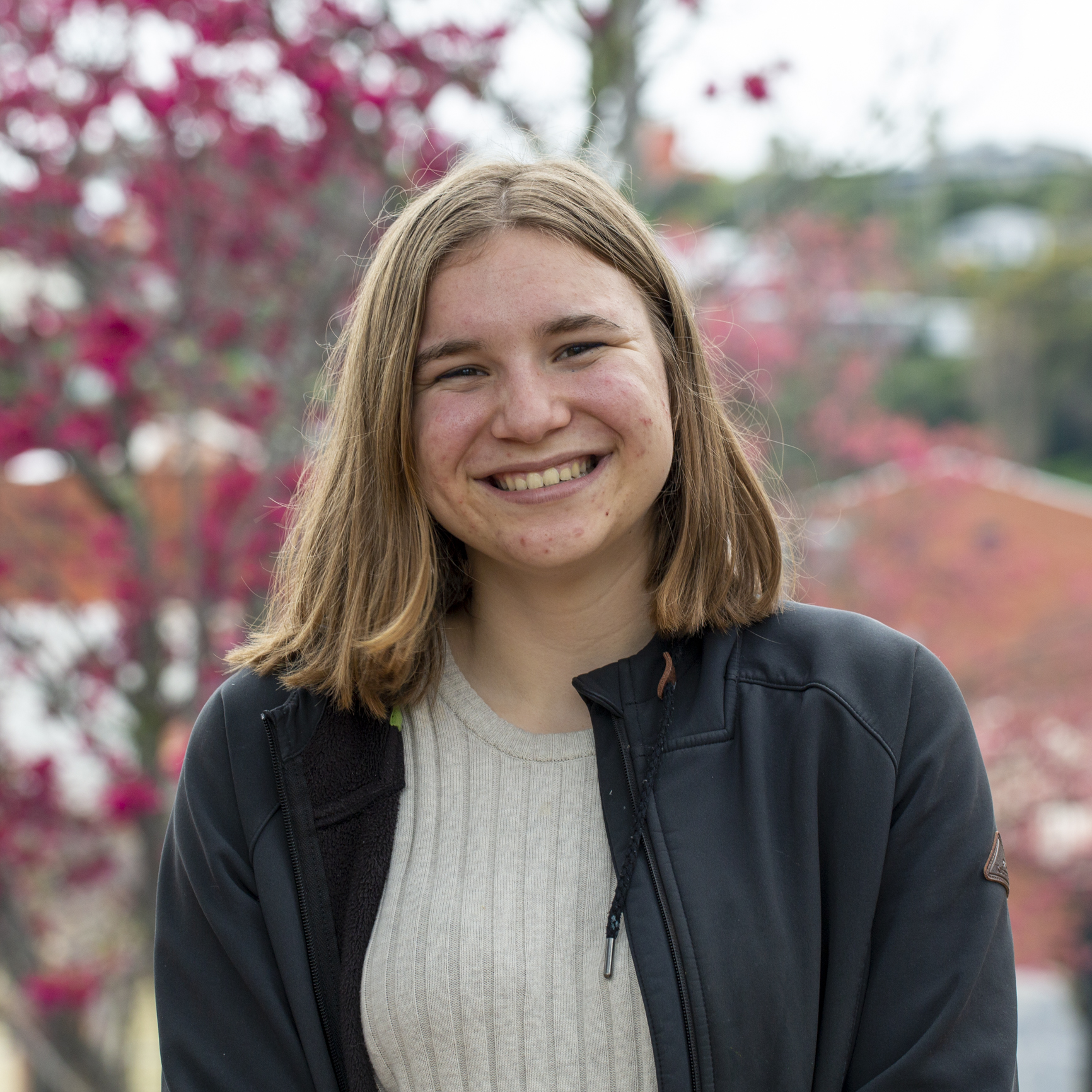
Freyja Wrigglesworth is a Year 13 student at Whanganui High School. In 2021, she was the winner of the Fine Arts Whanganui Gallery Young Artist Award and recently held a solo exhibition there which was included as part of the prize. Her interest in art spans a number of media; from painting, to watercolour, drawing and also printmaking – with ambitions to expand into oil pastels, and sculpture. After finishing this year at school, Freyja is planning to study art at university.
See Freyja’s selections on our Explore the Collection ‘My Choice Exhibition Series’ highlight here.
Ted Lewis, Reflections, 1940s-1980s, 1978/9/1
“I was drawn to this work by Ted Lewis because of the bright and bold colours used in the trees. The wide array of different colours in the landscape make me feel refreshed and cheerful. It reminds me of why I love bright colours so much.”
E. Mervyn Taylor, Nga Huia, 1920s-1960s, 1955/8/3
“I love this artwork because of the attention to detail in the birds but also equally in the background fauna. The precise line work gives a neat and cohesive look to the overall work. E. Mervyn Taylor balances the black and white really well, this means nothing looks out of place or unintentional.”
Hans Heysen, The Red Gum, 1936, 1937/2/1
“The first thing I looked at and noticed in this work was the Gum tree. Its beautifully warm-toned leaves have been painted using a large array of colours scattered throughout the branches. The trunk also is made up of many different colours, which adds an interesting shadow effect to the tree. The soft blue and purple used in the background give a sense of depth to the landscape. I keep finding myself getting lost in this painting.”
Bill Hammond, Living Large No. 5, 1995, 1996/18/1
“I am currently using Bill Hammond as my artist model for my NCEA Level 3 art boards, so finding this piece gave me a bit of inspiration and helped develop ideas. There are so many different characters doing their own thing, it makes it easy to get lost in the painting. The use of dreary colours adds a moody, dark tone to the piece.”
Violet Whiteman, Apple Blossoms, 1929, 1928/1/3
“I like the way the artist uses contrast in the painting to create beautiful shadows in the tree trunk. Throughout the painting I noticed that she uses a lot of pastel colours which makes me think of a spring morning. With the hints of white in the apple tree supporting the idea of spring with its flowers. I love the little dirt path coming into the foreground because it adds something else to observe and follow in the painting.”
Mina Arndt, Study of an Old Man’s Head, c. 1900-1926, 1961/2/7
“This portrait of a man depicted in Mina Arndt’s charcoal drawing is full of emotion, with the contrast adding and amplifying it. The look in his eyes make me feel as if he is analysing me and who I am. There are no colours in this work, which I think helps the viewer to not be distracted from the details in his face.”
Category
Past Exhibitions 2022